
How I Would Redesign a NZ Trades Website Hero Section to Actually Capture Leads
Quick answer: A high-converting trades website hero section needs five things visible before the visitor scrolls: a customer-focused headline, a prominent clickable phone number, trust signals (reviews, years in business, licensing), a short quote form embedded on the page, and a single clear call to action. Most NZ trades sites are missing at least three of these, and it's costing them leads every day.
I spend a lot of time looking at NZ business websites. And I keep seeing the same mistake, over and over, on trades sites in particular.
The homepage looks fine. It has the logo, a photo, some text about their services, and a button. But here's the problem: the button says something like "View Our Services" and it sends the visitor deeper into the website instead of turning them into a lead.
This week I pulled up a real NZ plumbing, electrical and drainage company's website and did a live above-the-fold redesign. I've blurred the company details so this isn't about calling anyone out. Every issue I found is one I see on dozens of NZ trades sites every month.
What I Was Looking At
Here's the original above-the-fold (the section visible before you scroll):
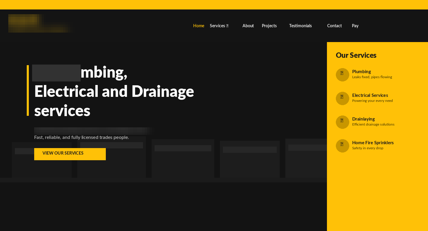
At first glance it looks reasonable enough. Yellow and black colour scheme, company logo, navigation across the top, a hero image of their fleet, and a headline describing their services.
But when you look at it through a conversion lens, five problems jump out immediately.
Why Do Most Trades Websites Fail to Convert Visitors Into Leads?
Most trades websites fail to convert because they're built like brochures, not lead-capture tools. They describe the business instead of addressing the customer's problem, hide the two conversion paths that matter (calling and requesting a quote), and give first-time visitors no immediate reason to trust them. Here are the five specific problems on this site.
1. The CTA sends people the wrong direction
The call to action button says "View Our Services." That sounds helpful, but what it actually does is send a visitor who might be ready to call away from a conversion and into another page of the site. For a trades business, the only two things you want someone to do from your homepage are: call you, or fill in a quote request form. Everything else is a detour.
A good rule of thumb for any trades website: if your primary CTA button doesn't contain the words "quote," "call," "book," or "get started," it's probably not working hard enough.
2. No trust signals above the fold
If I land on a tradesperson's website for the first time, I have one immediate question: "Can I trust these people?" The original site gives me no answer. No star rating. No number of jobs completed. No "Licensed Master Tradesperson" badge. No mention of how many years they've been operating.
Trust signals are not bragging. They are the thing that turns a hesitant visitor into a phone call. For trades businesses especially, a single line that says "4.9 stars from 180+ Google Reviews" can lift conversions meaningfully because it answers the trust question before the visitor even has to ask it.
3. The phone number is invisible
The phone number exists on the site. But it's in a thin yellow top bar in small text, easy to miss on desktop and almost certainly gone on mobile. For a trades business, the phone number should be the most visible element on the entire page after the headline. It should appear in the header in a large font, and ideally be clickable on mobile with a "Call Now" label.
4. The headline is about the business, not the customer
"[Business name] for Plumbing, Electrical and Drainage services." That's a description of the company. What the visitor actually wants to know is: can you solve my problem, can you come quickly, and will it be straightforward?
A headline that speaks to the customer's situation ("Got a Plumbing Problem? We Fix It.") pulls attention in a way that a company description never will. It creates an immediate "yes, that's me" moment that keeps people on the page.
5. There's no way to request a quote without leaving the page
If someone is ready to enquire but not ready to call, the original site gives them no option on the homepage. They'd need to click through to a contact page. Every extra click is a drop-off point. A quote form on the homepage, especially one embedded as a card in the hero section, removes that friction entirely.
What I Redesigned, and Why
Here's the conversion-focused version:
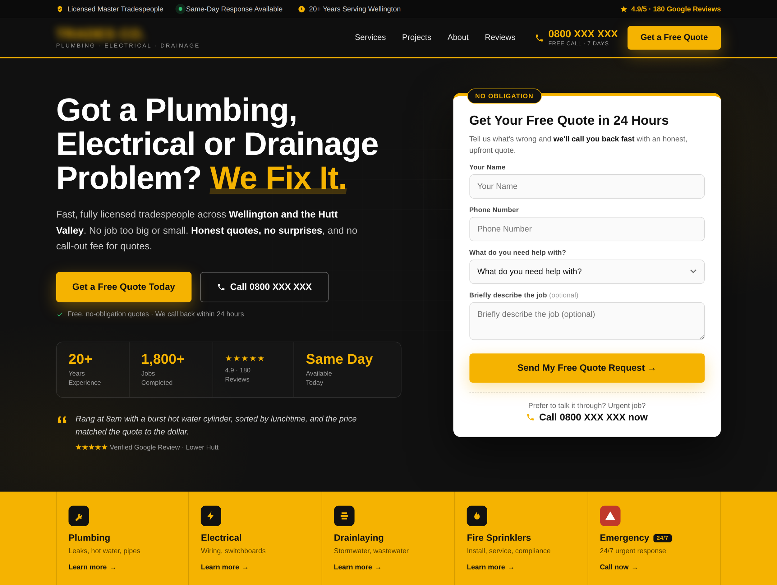
Let me walk through the specific decisions I made.
Trust bar at the very top. The first thing a visitor reads is now a strip confirming the business is licensed, has same-day availability, has 20+ years of experience, and holds a 4.9 Google star rating. These four things answer the four biggest objections a new visitor has before they even read the headline.
Phone number in the header, large and prominent. It's not in a tiny bar. It's right there in the nav, in yellow, at a size that's impossible to miss. For mobile, this becomes a tap-to-call link. Trades businesses get a large percentage of their leads from direct phone calls. Make that number findable in under two seconds.
A "Get a Free Quote" button in the header as well. Two conversion paths visible at all times: call or get a quote. Never just one.
Headline rewrites the value proposition from the customer's perspective. "Got a Plumbing, Electrical or Drainage Problem? We Fix It." This addresses the visitor's situation directly. The word "problem" is doing a lot of work here. The vast majority of people searching for a tradesperson have a problem they want solved. The headline acknowledges that instantly.
Embedded lead capture form in the hero. A clean white card with a "no obligation" badge, four simple fields and a clear CTA ("Send My Free Quote Request") means a visitor can initiate contact without going anywhere else. The form is short enough to fill in under 60 seconds, and it includes a "prefer to talk it through?" phone option at the bottom so callers and form-fillers both have a path inside the same card.
Two CTAs in the hero body. A primary yellow "Get a Free Quote Today" button and a secondary "Call 0800 XXX XXX" button. This respects that some people prefer to call and some prefer to fill in a form. Don't force them to choose your preferred channel.
Social proof statistics. 20+ years, 1,800+ jobs, 4.9 star rating, same-day availability. These four numbers tell the full story of a reliable, experienced, well-reviewed business. They sit below the CTAs so they reinforce the decision to enquire, not distract from it.
A real customer review, right in the hero. A short verified Google review with a specific story ("sorted by lunchtime, price matched the quote to the dollar") does more work than star ratings alone. Specifics are believable. Generic praise isn't.
Services strip at the bottom. Instead of a separate "Our Services" panel competing for attention with the hero (as in the original), the services are listed in a clean strip below the fold. They're still immediately discoverable, but they don't compete with the lead-capture goal of the hero.
How Do You Reduce Friction on a Trades Website?
You reduce friction by removing every unnecessary step, field, click and decision between the visitor and the enquiry. On a trades website, that means a quote form on the homepage itself, no more than four fields, a dropdown instead of a free-text box where possible, tap-to-call phone numbers on mobile, and one obvious primary action per screen.
Friction is anything that makes contacting you slightly harder than it needs to be. Individually, each point of friction feels trivial. Collectively, they're why a site with plenty of traffic gets no enquiries. Here's what that looked like in this redesign:
Fewer fields, smarter fields. The form asks for four things: name, phone, what they need help with, and an optional job description. The "what do you need help with?" field is a dropdown, not a text box. Picking from a list takes two seconds, and it means urgent jobs can identify themselves instantly.
Only one field is genuinely optional, and it's labelled as such. Marking the job description "(optional)" tells hesitant visitors they can be done in three fields if they want. Never make people guess what's required.
No page changes required. The visitor can go from landing on the page to submitting an enquiry without a single click of navigation. Every page load you remove from the journey is a drop-off point you've deleted.
Tap-to-call everywhere. Every phone number on the page is a live tel: link. On a trades site, a phone number that isn't tappable on mobile is a small daily tax on your lead flow.
An escape hatch for callers. At the bottom of the form card: "Prefer to talk it through? Call now." Some people will never fill in a form. Give them their preferred channel inside the same element instead of making them hunt for it.
A useful way to audit your own site: count the number of taps, clicks and typed characters between landing on your homepage and completing an enquiry. Then ask what you can delete.
How Do You Build Trust With First-Time Website Visitors?
You build trust by answering the visitor's unspoken objections before they have to ask. For a trades business, the four objections are: "Are you qualified?", "Are you experienced?", "Do other people rate you?", and "Will I get stung on price?" Every trust element above the fold should answer at least one of those.
Here's how each objection maps to an element in the redesign:
Two principles worth remembering:
Specific beats general. "1,800+ jobs completed" is more persuasive than "years of experience." "4.9 from 180 reviews" is more persuasive than "highly rated." Numbers feel verified; adjectives feel like marketing.
Trust works hardest next to the ask. Trust signals placed near the CTA and the form do the most work, because that's the exact moment hesitation happens. A review quote next to the quote button converts better than the same quote buried on a testimonials page.
The Principles Behind Every Decision
Every change I made to this site came back to three questions:
1. What does someone need to believe to become a lead? That the business is trustworthy, experienced, available, and easy to contact. Every element above the fold should answer at least one of those things.
2. What is the single most important action I want the visitor to take? For a trades business, it is almost always: request a quote or call us. The page should be designed around making those two things frictionless. Everything else is secondary.
3. How quickly can a first-time visitor answer their own question? If a visitor has to read three paragraphs before they understand what you do and why they should choose you, you've already lost them. The above-the-fold section should answer "who is this for, what do they offer, why should I trust them, and what should I do next?" in under 10 seconds.
What This Means for Your NZ Trades Website
If you're running a trades business in New Zealand and you're not getting leads from your website, there's a very good chance the above-the-fold section is the problem. Not the whole site. Just the first screenful.
You don't necessarily need a full redesign. Sometimes moving your phone number, changing your headline, and adding a quote form to the homepage is enough to meaningfully change your lead flow.
Start by asking yourself: if someone landed on my homepage right now and knew nothing about my business, would they immediately know what I do, why I'm credible, and how to get in touch? If the answer is "probably not," the above the fold is worth looking at.
Frequently Asked Questions
What should a trades website hero section include?
A trades website hero section should include a customer-focused headline, a large clickable phone number, a short quote request form, trust signals (Google review rating, years in business, licensing), and one clear primary call to action. All five should be visible without scrolling on both desktop and mobile.
What is the best call to action for a trades website?
The best call to action for a trades website is "Get a Free Quote" paired with a "Call [number]" option. These match the two ways trades customers actually enquire. Avoid CTAs like "View Our Services" or "Learn More", which move visitors deeper into the site instead of converting them.
How many fields should a quote request form have?
A quote request form should have three to four fields at most: name, phone number, and what the customer needs help with, plus an optional job description. Every additional required field increases form abandonment, and any detail beyond those can be gathered on the follow-up call.
Where should trust signals go on a website?
Trust signals work hardest above the fold and directly next to your calls to action, because that's where visitor hesitation happens. A review rating in the top bar, proof statistics under the primary CTA, and a "no obligation" note on the quote form each answer an objection at the exact moment it arises.
Do trades websites really lose leads from small friction points?
Yes. Small friction points compound. A phone number that isn't tap-to-call, a quote form hidden on a contact page, and a required field that didn't need to be required each cost a percentage of enquiries, and together they can be the difference between a website that generates leads weekly and one that generates none.